2-09: Stacking and Mapping
0.1 To-do
1 Purpose
stacking dataframe
creating line plots and box plots
mapping values other than x and y
creating a List object
2 Script and data for this lesson
The script for the lesson is here
Data for the lesson: LansingJanTempsFixed.csv
3 GGPlot mapping
This lesson is designed to give an overview of the many issues that occur when you are creating plots in GGPlot and some of the fixes. There is the huge topic of mapping in GGPlot that we use in this lesson, but do not have time to fully explain (we go into much more detail in our dedicated GGPlot class…). Mapping is how you relate data in a data frame to a visual aspect of a plot. We have already mapped data in a data frame to the x and y axis of a plot – but, you can map many other visual aspects to data like size, shape, and, in this lesson, color.
4 Reading in the data frame
We will be using the data from lansingJanTempsFixed.csv that has 6 years of January temperatures in Fahrenheit. First we need to read in the file, lansJanTempsFixed.csv, and save the temperature data to a data frame:
lansJanTempsDF = read.csv(file = "data/lansingJanTempsFixed.csv");5 Line Plots
We are going to go over the multiple ways in GGPlot to make a line plot for each of the 6 temperature column in one canvas area. The ggplot component that creates a line plot is geom_line().
The simplest way to do it is to create six geom_line() components – one for each column in the data frame:
plot1 = ggplot( data=(lansJanTempsDF),
«mapping = aes(x=1:31)») +
geom_line( mapping=aes(y=Jan2011),
color = "red") +
geom_line( mapping=aes(y=Jan2012),
color = "green") +
geom_line( mapping=aes(y=Jan2013),
color = "orange") +
geom_line( mapping=aes(y=Jan2014),
color = "blue") +
geom_line( mapping=aes(y=Jan2015),
color = "purple") +
geom_line( mapping=aes(y=Jan2016),
color = "black") +
labs( title="January Temperature",
subtitle="Lansing, MI -- 2011-2016",
x = "January Days",
y = "temperature (F)") +
theme_bw();
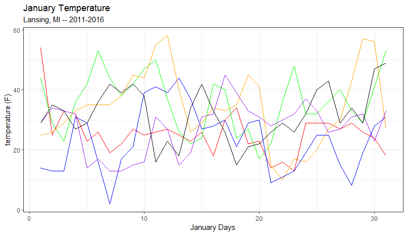
plot(plot1);Since the x-axis gets mapped to the same date values (1 to 31) for each line plot, we can place the x mapping in ggplot() call. This makes the x mapping of 1:31 universal for all components in the canvas area.
Each geom_line component is also customized with a color subcomponent.
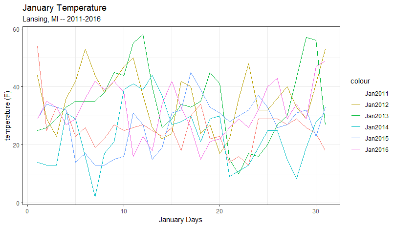
6 Adding a legend
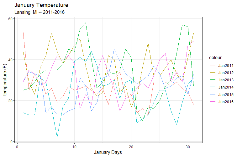
The problem with Figure 1 is that the individual line plots are not labelled. We would like to add a legend to the plot that maps the color to the year and adding a legend in GGPlot is awkward. Generally speaking GGPlot will put a legend on the plot when something is mapped other than x or y. We are going to map color. To do this, we move color from being a subcomponent of the geom_line to being a mapped element of the geom_line.
plot2 = ggplot( data=(lansJanTempsDF),
                mapping = aes(x=1:31)) +
  geom_line( mapping=aes(y=Jan2011, color = "Jan2011") ) +
  geom_line( mapping=aes(y=Jan2012, color = "Jan2012") ) +
  geom_line( mapping=aes(y=Jan2013, color = "Jan2013") ) +
  geom_line( mapping=aes(y=Jan2014, color = "Jan2014") ) +
  geom_line( mapping=aes(y=Jan2015, color = "Jan2015") ) +
  geom_line( mapping=aes(y=Jan2016, color = "Jan2016") ) +
  labs( title="January Temperature",
        subtitle="Lansing, MI -- 2011-2016",
        x = "January Days",
        y = "temperature (F)") +
  theme_bw();
plot(plot2);
In this plot, we moved color to the mapping of the geom_line and set color to the text we want displayed in the legend. This solution adds a legend with the text but the line colors are chosen by GGPlot. Note: There is a way to customize these color but that is beyond the scope of this class.
7 Stacking the data frame
The most common (and pretty ugly) technique used to plot multiple line plots on one canvas is to create a new data frame that has all the data you want to plot in two columns – this process is often called melting or stacking the data frame.
We can use stack() to create a stacked data frame:
stackedDF = stack(lansJanTempsDF);The stacked data frame has the same data as the original data frame but everything is put in two columns:
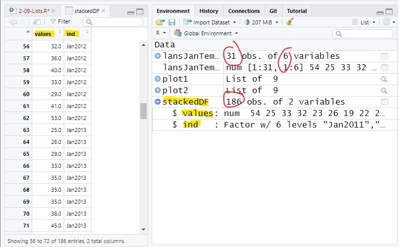
The stacked data frame has 186 rows (31 days * 6 years) and two columns:
column 1: combined the 6 temperature columns into one column called values
column 2: contains the names of the six temperature columns (2011 to 2016) called ind
The 6 years of data are now stacked on top of each-other with the first 31 rows containing values from 2011, the next 31 rows containing values from 2012, etc… The ind columns give the year the temperatures came from.
7.2 Plotting the stacked data frame
With the stacked data frame, we only need one geom_line component to plot all 6 lines. This works because of the color mapping. The color mapping tells GGPlot to create a distinct line for each different value in the ind column – and set each to a different color. The ind column has 6 different value – the 6 column names from the original data frame (Jan2011, Jan2012,…).
The x-axis represents the days from 1 to 31. We have 186 rows but every 31 rows represents a new line plot (31 * 6 = 186). So, we want to repeat the values 1 to 31 six times.
The y mapping is the temperature values from the original data frame put into one long values column.
plot3 = ggplot( data=(stackedDF)) +
  geom_line( mapping=«aes(x=rep(1:31, times=6)», y=values, color=ind) ) +
  labs( title="January Temperature",
        subtitle="Lansing, MI -- 2011-2016",
        x = "January Days",
        y = "temperature (F)") +
  theme_bw();
plot(plot3);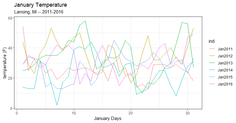
8 Using for loops to plot 6 columns
I consider using for loops to be the most robust solution because it gives you more control over what to plot and it maintains the integrity of the original data frame. It is also probably the most difficult method:
  plot4 = ggplot( data=(lansJanTempsDF));  # create a canvas
  for(i in 1:ncol(lansJanTempsDF))         # add plots to canvas one at a time
  {
    # replace i by with !!(i) -- avoids Lazy Evaluation
    «plot4 = plot4» + geom_line( mapping=aes(x=1:nrow(lansJanTempsDF),
                                             y=lansJanTempsDF[,«!!(i)»],
                                             color=colnames(lansJanTempsDF)[«!!(i)»]) )
  }
  # add the labels and theme to the canvas
  «plot4 = plot4» + labs( title="January Temperature",
          subtitle="Lansing, MI -- 2011-2016",
          x = "January Days",
          y = "temperature (F)") +
  theme_bw();
  plot(plot4);
In this example, the for loop adds the six plot components to the plot4 canvas one at a time. When mapping in a for loop, you need to replace the index variable, in this case i, with !!(i). The reason is here: Extension: Lazy Evaluation
After the plot components are added, we then add the labels and theme to plot4.
9 Unstacking the data frame
You can take a stacked data frame and return it to original state using unstack():
origDF = unstack(stackedDF);And origDF looks just like the original lansJanTempDF
Note: The stacked version of a dataframe is often called long format and the original dataframe called wide format.
10 Boxplots
A good way to visually compare the six years of January temperatures is to use a boxplot. In GGPlot, the component to use is geom_boxplot. For our first attempt, we will just create two boxes representing the columns Jan2011 and Jan2012.
Like all plotting components in GGPlot, geom_boxplot needs to be mapped. The y-axis represents the temperatures so we can map y to the columns, Jan2011 in one box and Jan2012 in the other.
We also need to map x to something otherwise the two boxplots will appear right on top of each other (try it!). We can start by mapping the boxplot to the years they represent:
plot5 = ggplot(data=lansJanTempsDF) +
  geom_boxplot(mapping=aes(x=2011, y=Jan2011)) +
  geom_boxplot(mapping=aes(x=2012, y=Jan2012)) +
  theme_bw();
plot(plot5);
This code successfully creates two boxplots but the x-axis is a bit weird:
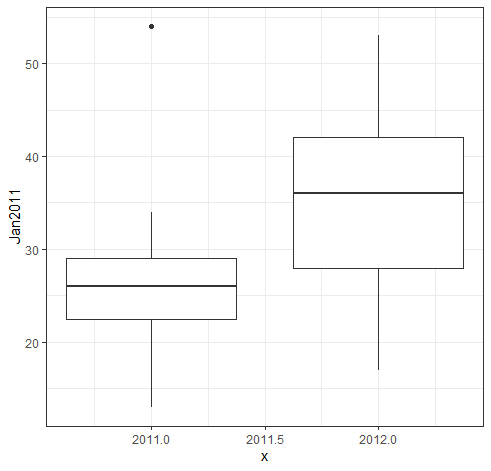
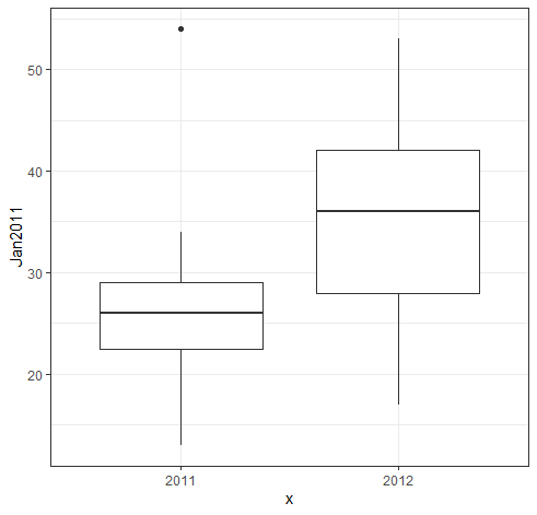
Because we used numbers to map the x-axis, GGPlot assumed a continuous and numeric x-axis. But, the x-axis in a boxplot is really a discrete axis – we are not plotting value in between 2011 and 2012. If we want a discrete axis, then we need to put the years in quotes (i.e., make the year a string value):
  plot6 = ggplot(data=lansJanTempsDF) +
    geom_boxplot(mapping=aes(«x="2011"», y=Jan2011)) +
    geom_boxplot(mapping=aes(«x="2012"», y=Jan2012)) +
    theme_bw();
  plot(plot6);
Now, we have a discrete x-axis:
11 Box Plots using the stacked dataframe
Just like with lines plots, there is no great way to create boxes from multiple columns in a dataframe. We could plot all six columns by creating six geom_boxplot components, one for each year. But, in programming, you generally do not want to repeat code – this would get messy if there were 20 columns.
The most common technique used for plotting multiple columns is to use a stacked dataframe.
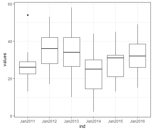
Using the stacked dataframe, we can plot all 6 years using one geom_boxplot component. The works by mapping x to the ind column (which has the years) and mapping y to the values column (which has all the temperature values).
plot7 = ggplot(data=stackedDF) +
  geom_boxplot(mapping=aes(x=ind, y=values)) +
  theme_bw();
plot(plot7);
The x-axis of the boxplot is labelled with the names of the columns and the y-axis has the box for each year:
12 Stacking a subset of the columns
We might not want all of the data from the original dataframe. We can create a stacked dataframe that only has a subset of the columns from the original data frame.
This stacked dataframe only has the values from 2 columns, the3rd and 6th (2013 and 2016– 62 values in all):
stackedDF2 = stack(lansJanTempsDF[,c(3,6)]); # 2013 and 2016And this stacked dataframe has the values from 4 columns: the1st, 2nd, 5th, and 6th (2011, 2012, 2015, & 2016 – 124 values in all):
stackedDF3 = stack(lansJanTempsDF[,c(1,2,5,6)]); # 2011, 2012, 2015, & 2016In the Environment tab we see the two new stacked dataframes, both with 2 columns (values and ind) and 62 values (for two Januaries) and 124 values (for four Januaries)
🞃 stackedDF2:   62 obs. of 2 variables
    $ values: num 25 26 29 33 35 35 ...
    $ ind    :  Factor w/ 2 levels "Jan2013",...
🞃 stackedDF3:   124 obs. of 4 variables
    $ values: num 54 25 33 32 23 ...
    $ ind    :  Factor w/ 4 levels "Jan2011",...
12.1 Plotting the subset stacked dataframe
We can plot the four boxes from dataframe stackedDF3 just like we plotting all six boxes using stackedDF:
plot8 = ggplot(data=«stackedDF3») +
  geom_boxplot(mapping=aes(x=ind, y=values)) +
  theme_bw();
plot(plot8);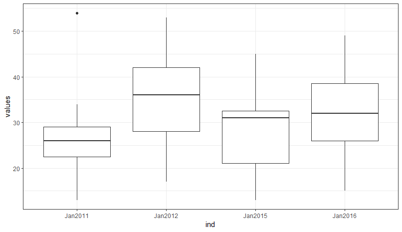
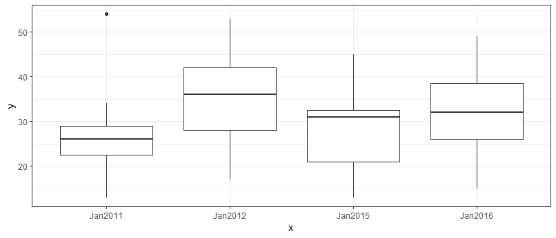
12.2 Plotting a subset using for loops
Again, this author believes the most robust way to plot the subset data is to use for loop. Once again, this allows you to work with the original data frame – there is no need to create a stacked data frame.
plot9 = ggplot( data=(lansJanTempsDF));
for(i in «c(1,2,5,6)»)   # cycle through the four columns
{
  ## map the column names to x and the column values to y
  plot9 = plot9 + geom_boxplot(mapping=aes(x=colnames(lansJanTempsDF)[!!(i)],
                                            y=lansJanTempsDF[,!!(i)] ))
}
plot9 = plot9 + theme_bw();
plot(plot9);
In this code,
the for loops only cycles through the four columns we want to plot c(1,2,5,6).
x is mapped to the subsetted column name
y is mapped to the subsetted column values
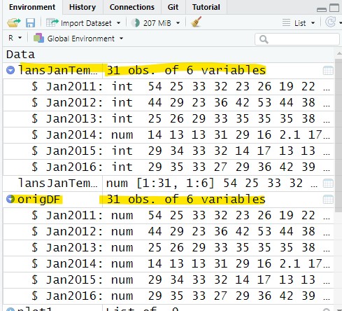
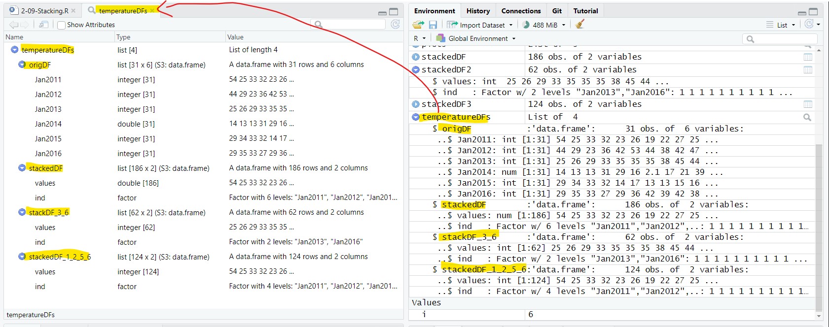
13 Saving data frames to one object
In this lesson, we created four data frames:
lansJanTempsDF: the original data frame
stackedDF: a stacked version of the full data frame
stackedDF2: a stacked version of columns 3 and 6 only
stackedDF3: a stacked version of columns 1, 3, 5, and 6
We are going to use these data frames in the next lesson. In the next lesson, we could just reopen the lansingJanTempsFixed.csv file, save the data to a data frame and then create the stacked dataframes. But, since we have already done that work, it would be easier to pass the data frames from this lesson to the next lesson.
We will create one object that holds all four data frame using list(). The object is a List object (we will be talking a lot more about List object in the next few lessons):
temperatureDFs= list("origDF" = lansJanTempsDF,
                     "stackedDF" = stackedDF,
                     "stackDF_3_6" = stackedDF2,
                     "stackedDF_1_2_5_6" = stackedDF3);
The value in quotes is the name of the object – you can choose the name but you should use variable naming conventions.
temperatureDFs appear in the Environment as a List object with four data frames inside it. We can view the data frames in the list by clicking on the arrow in the Environment tab or double-clicking on temperatureDFs to see it in a viewer tab:
13.1 Saving the List object to a file
We want to use the List object with four data frames in the next lesson. To do this, we need to save the List to a file – a file we will open in the next lesson. There are two different types of file we can use: rdata and rds. We are going to use both to show the pro and cons of each in the next lesson.
save(temperatureDFs, file = "data/tempDFs.rdata");   # save to rdata file
saveRDS(temperatureDFs, file = "data/tempDFs.rds");  # save to rds file
There should now be files named tempDFs.rdata and tempDFs.rds in the data folder. Both of these files contain the List object temperatureDFs.
14 Application
A) Open the file Lansing2016NOAA.csv and save the contents of the file to a data frame named weatherData
B) Create a stacked data frame named stackedWD that only contains the three temperature columns from weatherData (maxTemp, avgTemp, and minTemp).
stackedWD will have 2 columns (values and ind) and 1098 rows (366 * 3).
C) Create six GGPlot canvases, the individual canvases will contain:
Three lines plots (maxTemp, avgTemp, and minTemp) using weatherData and three geom_line components – the method used in Figure 1
Three lines plots (maxTemp, avgTemp, and minTemp) using stackedWD and one geom_line component.
Three lines plots (maxTemp, avgTemp, and minTemp) using weatherData and a for loop.
Three box plots (maxTemp, avgTemp, and minTemp) using weatherData and three geom_boxplot components
Three box plots (maxTemp, avgTemp, and minTemp) using stackedWD and one geom_boxplot component.
Three box plots (maxTemp, avgTemp, and minTemp) using weatherData and a for loop.
Save the script as app2-09.r in your scripts folder and email your Project Folder to Charlie Belinsky at belinsky@msu.edu.
Instructions for zipping the Project Folder are here.
If you have any questions regarding this application, feel free to email them to Charlie Belinsky at belinsky@msu.edu.
14.1 Questions to answer
Answer the following in comments inside your application script:
What was your level of comfort with the lesson/application?
What areas of the lesson/application confused or still confuses you?
What are some things you would like to know more about that is related to, but not covered in, this lesson?
15 Extension: Lazy Evaluation
This is probably the one programming topic that has caused the most agony in this author’s life as it is unintuitive and happens unexpectedly in many programming languages…
There are 7 columns in lansJanTempsDF, which means the for loop will cycle 7 times. Each time with a different value for i (1, 2, 3, 4, 5, 6, and 7).
for(i in 1:ncol(lansJanTempsDF))         # add plots to canvas one at a time
{
  plot4 = plot4 + geom_line( mapping=aes(x=1:nrow(lansJanTempsDF),
                                         y=lansJanTempsDF[,i],
                                         color=colnames(lansJanTempsDF)[i]) )
}
However, if you execute the code above you will only see one plot – the plot for the seventh cycle (when i=7). Actually, the seventh plot got plotted seven times but they overlap each other so you only see one.
The reason this happens is that R, in the background, will first stack up the code from all seven cycles of the for loop like this:
plot4 = plot4 + geom_line( mapping=aes(x=1:nrow(lansJanTempsDF),
                                         y=lansJanTempsDF[,«i»],
                                         color=colnames(lansJanTempsDF)[«i»])
plot4 = plot4 + geom_line( mapping=aes(x=1:nrow(lansJanTempsDF),
                                         y=lansJanTempsDF[,«i»],
                                         color=colnames(lansJanTempsDF)[«i»])
plot4 = plot4 + geom_line( mapping=aes(x=1:nrow(lansJanTempsDF),
                                         y=lansJanTempsDF[,«i»],
                                         color=colnames(lansJanTempsDF)[«i»])
... (4 more) ...
And then execute each command in the stack. This happens all the time when programming for loops and it is normally not an issue. Except, in this case, R does not realize that i is the index variable. R assumes that i=7 because that is the value of i at the end of the for loop (i.e., after the seventh cycle). So, R replaces i with 7 for every command. This is called Lazy Evaluation and I cannot explain why it happens here, but I can say that I have experienced it many times in many programming languages in my career.
!!() is a function that forces R to immediately evaluate what is inside the parentheses (i.e., before R stacks the commands). This means the stacked commands will look like this and execute properly:
plot4 = plot4 + geom_line( mapping=aes(x=1:nrow(lansJanTempsDF),
                                         y=lansJanTempsDF[,«1»],
                                         color=colnames(lansJanTempsDF)[«1»])
plot4 = plot4 + geom_line( mapping=aes(x=1:nrow(lansJanTempsDF),
                                         y=lansJanTempsDF[,«2»],
                                         color=colnames(lansJanTempsDF)[«2»])
plot4 = plot4 + geom_line( mapping=aes(x=1:nrow(lansJanTempsDF),
                                         y=lansJanTempsDF[,«3»],
                                         color=colnames(lansJanTempsDF)[«3»])
... (4 more) ...